projects
Company
Friendsurance
Friendsurance is a German insurtech company offering digital insurance solutions and a white-label insurance manager that allows customers to manage and explore their insurance coverage across different providers.
Field
Insurtech
Insurance
Digital product
Duration
06.2026
Tools
Figma
Miro
Roles
ux/ui design
information architecture
user flow
Company
Friendsurance
Friendsurance is a German insurtech company offering digital insurance solutions and a white-label insurance manager that allows customers to manage and explore their insurance coverage across different providers.
Field
Insurtech
Insurance
Digital product
Duration
06.2026
Tools
Figma
Miro
Roles
ux/ui design
information architecture
user flow
Company
Friendsurance
Friendsurance is a German insurtech company offering digital insurance solutions and a white-label insurance manager that allows customers to manage and explore their insurance coverage across different providers.
Field
Insurtech
Insurance
Digital product
Duration
06.2026
Tools
Figma
Miro
Roles
ux/ui design
information architecture
user flow
What was the challenge?
Friendsurance’s white-label insurance manager brings multiple insurance products into a single digital experience, but the onboarding and dashboard need to balance information, guidance, and commercial opportunities without overwhelming the customer. The challenge was to rethink the experience around three goals: communicate the product’s value earlier, reduce unnecessary complexity, and guide customers towards relevant next steps through clearer information hierarchy and personalised nudges.
What was the challenge?
Friendsurance’s white-label insurance manager brings multiple insurance products into a single digital experience, but the onboarding and dashboard need to balance information, guidance, and commercial opportunities without overwhelming the customer. The challenge was to rethink the experience around three goals: communicate the product’s value earlier, reduce unnecessary complexity, and guide customers towards relevant next steps through clearer information hierarchy and personalised nudges.
What was the challenge?
Friendsurance’s white-label insurance manager brings multiple insurance products into a single digital experience, but the onboarding and dashboard need to balance information, guidance, and commercial opportunities without overwhelming the customer. The challenge was to rethink the experience around three goals: communicate the product’s value earlier, reduce unnecessary complexity, and guide customers towards relevant next steps through clearer information hierarchy and personalised nudges.
UX/UI Design
Experience Strategy
The redesign focuses on shifting the experience from a data-first onboarding process towards a more value-driven and contextual journey. Instead of asking customers to provide information before understanding the benefit, the proposed flow establishes value early, progressively builds the customer profile, and uses that context to create more relevant actions and recommendations.
UX/UI Design
Experience Strategy
The redesign focuses on shifting the experience from a data-first onboarding process towards a more value-driven and contextual journey. Instead of asking customers to provide information before understanding the benefit, the proposed flow establishes value early, progressively builds the customer profile, and uses that context to create more relevant actions and recommendations.
UX/UI Design
Experience Strategy
The redesign focuses on shifting the experience from a data-first onboarding process towards a more value-driven and contextual journey. Instead of asking customers to provide information before understanding the benefit, the proposed flow establishes value early, progressively builds the customer profile, and uses that context to create more relevant actions and recommendations.
Current experience
Trusted platform → Personal details → Existing insurance → Life situation → Account → Dashboard
Proposed experience
Trusted platform → Value + account → Personal details → Life situation → Existing insurance → Dashboard
caption:
The flow was reorganised to communicate value earlier and establish the customer's context before presenting recommendations. The goal was not simply to reduce the number of steps, but to make each step feel purposeful.
Onboarding
The onboarding experience was restructured to communicate the product’s value before asking customers to invest significant time and personal information. Relevant questions are introduced progressively, with the customer’s life situation providing context for subsequent insurance recommendations. The revised sequence aims to reduce cognitive load while creating a clearer sense of purpose throughout the journey.

Onboarding
The onboarding experience was restructured to communicate the product’s value before asking customers to invest significant time and personal information. Relevant questions are introduced progressively, with the customer’s life situation providing context for subsequent insurance recommendations. The revised sequence aims to reduce cognitive load while creating a clearer sense of purpose throughout the journey.
Onboarding
The onboarding experience was restructured to communicate the product’s value before asking customers to invest significant time and personal information. Relevant questions are introduced progressively, with the customer’s life situation providing context for subsequent insurance recommendations. The revised sequence aims to reduce cognitive load while creating a clearer sense of purpose throughout the journey.
Header
Lorem Ipsum dolor

Header
Lorem Ipsum dolor
Header
Lorem Ipsum dolor
Header
Lorem Ipsum dolor

Header
Lorem Ipsum dolor
Header
Lorem Ipsum dolor
Header
Lorem Ipsum dolor

Header
Lorem Ipsum dolor
Header
Lorem Ipsum dolor
Header
Lorem Ipsum dolor

Header
Lorem Ipsum dolor
Header
Lorem Ipsum dolor
Design System
Foundations
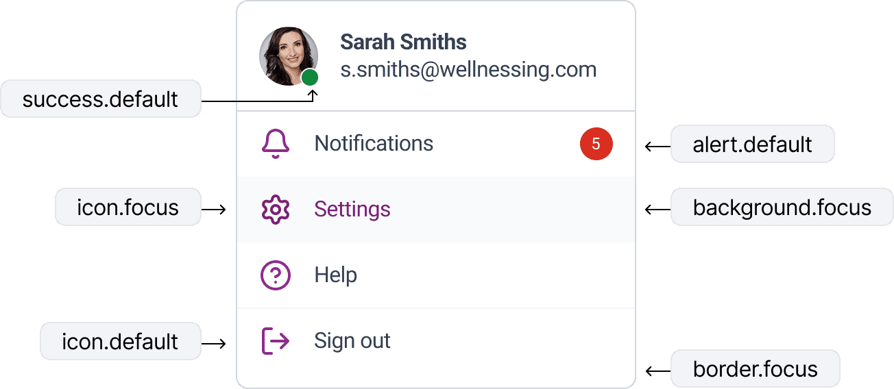
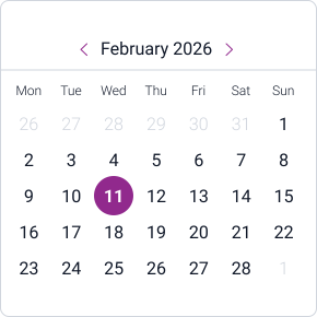
The interface improvements are grounded in a lightweight design system that ensures consistency across screens. Rather than treating each layout independently, core elements such as typography, color, spacing, and components were defined as reusable foundations. This system establishes clear hierarchy, semantic color usage, and predictable interaction patterns, enabling the interface to scale while maintaining visual coherence. The following elements illustrate how these foundations support the redesigned UI.
Design System
Foundations
The interface improvements are grounded in a lightweight design system that ensures consistency across screens. Rather than treating each layout independently, core elements such as typography, color, spacing, and components were defined as reusable foundations. This system establishes clear hierarchy, semantic color usage, and predictable interaction patterns, enabling the interface to scale while maintaining visual coherence. The following elements illustrate how these foundations support the redesigned UI.
Design System
Foundations
The interface improvements are grounded in a lightweight design system that ensures consistency across screens. Rather than treating each layout independently, core elements such as typography, color, spacing, and components were defined as reusable foundations. This system establishes clear hierarchy, semantic color usage, and predictable interaction patterns, enabling the interface to scale while maintaining visual coherence. The following elements illustrate how these foundations support the redesigned UI.
Heading 1
48 px
Heading 2
40 px
Heading 3
32 px
Heading 4
24 px
Body
16 px
Captions
12 px
Customer
Default
Customer
Hover
Customer
Pressed
Customer
Disabled
All
Upcoming
Cancelled
Completed
Confirmed
Pending
Cancelled

Express Facial
Emma Richardson
08:30 – 09:30
Express Facial

Swedish Massage

Express Facial
Checkbox
Radio
It's a Wrap!
Takeaways
This project reinforced the importance of designing onboarding around the value customers receive, rather than the information a product needs from them. In an insurance context, where relevance and trust are particularly important, the sequence of questions can be as meaningful as the interface itself. Moving from a data-first flow towards a more contextual experience creates opportunities to make recommendations feel more relevant while reducing cognitive load. The project also highlighted the importance of treating commercial nudges as part of the UX — not as separate sales mechanisms — so that the next best action feels useful to the customer as well as valuable to the business.
Note: The evaluation was based on heuristic analysis, UX best practices, and the objectives defined in the brief. No internal user research or analytics were available.
It's a Wrap!
Takeaways
This project reinforced the importance of designing onboarding around the value customers receive, rather than the information a product needs from them. In an insurance context, where relevance and trust are particularly important, the sequence of questions can be as meaningful as the interface itself. Moving from a data-first flow towards a more contextual experience creates opportunities to make recommendations feel more relevant while reducing cognitive load. The project also highlighted the importance of treating commercial nudges as part of the UX — not as separate sales mechanisms — so that the next best action feels useful to the customer as well as valuable to the business.
Note: The evaluation was based on heuristic analysis, UX best practices, and the objectives defined in the brief. No internal user research or analytics were available.
It's a Wrap!
Takeaways
This project reinforced the importance of designing onboarding around the value customers receive, rather than the information a product needs from them. In an insurance context, where relevance and trust are particularly important, the sequence of questions can be as meaningful as the interface itself. Moving from a data-first flow towards a more contextual experience creates opportunities to make recommendations feel more relevant while reducing cognitive load. The project also highlighted the importance of treating commercial nudges as part of the UX — not as separate sales mechanisms — so that the next best action feels useful to the customer as well as valuable to the business.
Note: The evaluation was based on heuristic analysis, UX best practices, and the objectives defined in the brief. No internal user research or analytics were available.
get in touch.
get in touch.
get in touch.
let's talk.
let's talk.
let's talk.
let's talk.
let's talk.
let's talk.
© 2026 Ricardo Quintas. All rights reserved.